When you design a logo, have you ever stuck in a phase where you don’t know where to start? You ask yourself where should you begin? What you should do first? Do you sketch first? Or go straight to your computer?
I believe every designer have their own process of creating a logo. I will show you how I created my own personal logo using the logo design process that most graphic designer stick with.
1. Questioning (free download questionnaire)
2. Competitor Research
3. Brainstorming/Mind Mapping
4. Brand Positioning
5. Sketching and Conceptualizing
6. Digitize
7. Choosing the Right Typeface
8. Coloring
9. Reflect and Refine
Questioning
This is the most important part. Never skip this step even you are designing a logo for yourself. This is where you learn more about a project. You can download the example of questionnaire that provide you the question I like to ask.
As I am trying to build an authority through online presence, I find out I need a logo that is easy to implement in online application. So a very simple shape logomark is preferable in my situation as simple logomark have a high visibility even in a very limited place such as favicon and social media profile picture.
Competitor Research
The questionnaire should give you more understanding about your client. At this stage you need to do research of all aspect area of your client. This will tell you which aspect area you need to avoid so your logo will not appear the same with the competitor.
This is where you will decide how you will make the logo stand out from competitor.
Brainstorming/Mind Mapping
Now I need to find out how my logo is going to look like. Which color to use, what shape should go for, any metaphor that I can relate to my logo or find out any characteristic of the client company that I can incorporate in the logo.
In my case, the challenge for me is that I need an abstract shape logo mark that is professional and represent connection between readers, clients and me. So nothing funky is going to happen in my logo. Instead I am going to design this logo with just a few simple shape.

Brand Positioning
Consider how your client want to position their business. Are they going for higher class market? Professional? Fun? Low budget?
The logo itself need to relate to the core value of your client’s company stand for. Take a look at the graph below created by Ray Vellest.

Sketching and Conceptualizing
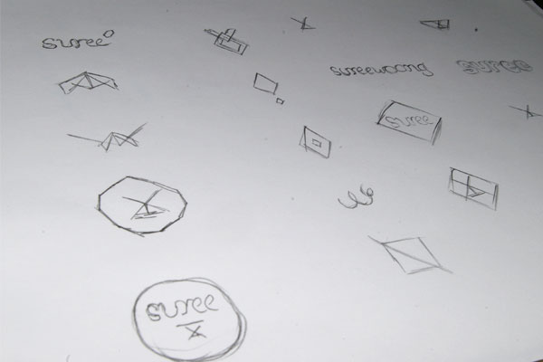
Most graphic designers love to put sketching as a first step to conceptualizing their ideas because ideas flow much faster when using this traditional method.
You can write and sketch whatever ideas or shape that comes through in your mind with just a few single strokes from your 3 inches pencil.
Below is some example of my sketches.

Digitize
Pick a few concepts from your sketches that provide the best solution. I heard this somewhere that says “there is no bad ideas, just bad decisions.”
Note that the logo are in black and white. This will let me to put more focus on the shape of the logo instead of being distracted. Sometimes, your client may apply their logo in black and white on print application to save some print cost.
So you have to make sure that your logo still stand out in black and white. That is why I don’t recommend you to have too much transparent or gradient color in your logo.
One more thing to remember is always work on your logo in vector format so it can be scaled in any size without making your artwork pixelated when printed out.
Choosing the Right Typeface
Choosing a typeface can be tricky. Remember this, avoid any fancy font or any font that is too thin if possible. Thin typeface will make your logo invisible when scaled down. A good typeface should blend in well with the concept and shape of your logo.

Before(above) and after(bottom) kerning
As you can see in the image above, I am using Georgia with slight modification on the “S” and kerning.
Sometimes, a font can turn out really good looking typeface with a bit of adjustment. imjustcreative logo from Graham Smith is another example.
I’ve read a post from him where he mention how his logo was created. If not mistaken he is using Helvetica Bold on his logo with a bit of modification on the kerning. I am trying to find the post but it seems out of nowhere. Let me know in the comment box below if you stumble that post.

Coloring
Hot pink on my logo? I try to avoid any color that look similar with my competitor. In this case I’ve choose a very bright blue and orange to reflect the values stated in my questionnaire.
Reflect and Refine
What I like to do in this part is let your logo sleep on it. Come back tomorrow and edit your logo with a fresh eye. I find this method very useful to identify any flaw with a very clear mind. Usually I will take a week before deadline to reflect and refine.
As for my logo, it took me almost a month to make the final decision. I know it’s a long time. I would run out of business if I did this to my client. A week of reflect and refine is recommended.
This is the final result.


You can get this corporate identity mock up when you subscribe Refining Designers in the orange signup box below!
So does this logo design process help on your next project? Just tweet and like this post as a thumbs up!

Pingback: Logo Design Guide : 14 Rules on Creating Timeless Logo
Pingback: 7 Deadly Client You Should Avoid