DC comic first emblem 1940-1942
Have you seen the first DC comic logo? DC comic emblem was founded in 1934 as National Allied Publications. The first DC comic emblem was formed with a simple circle surrounded with the words “A Publication” and The DC initial mark was placed on the centre of the logo. Did you know DC refer to Detective Comics?
1942
DC comic emblem 1942-1949
Superman was a huge success in the early 1940, soon in 1942, a new logo was introduced with the words “Superman” added into “A DC Publication”.
1949
1949-1970
In November 1949, DC comic company name was changed to National Comic Publications. Small changes was made on the logo to incorporate with the new company name.
1972
In 1972, a simple white circle with bold sans serif DC initials was introduced. I think this logo is much more recognizable compared with the previous logo.
1974
In 1974, the logo was redesigned again, a pair of star and the words “The Line of DC Super stars” was added in the logo. This somehow make the logo look very busy and crowded for me.
1976
1976-2005
In 1976, when Jenette Kahn become DC’s publisher, a new logo was redesigned by Milton Glaser. This logo also called as “The Bullet”. Since then this logo has become the longest running logo in DC history. What do you think about this logo?
2005
2005
This new logo also called as the DC spin was created by Josh Beatman of Brainchild Studios. This logo reflect DC expand from being a publisher into a larger entertainment section. Such as film, Batman Begins, Superman Returns, The Dark Knight, and so on. You name it!
2012
DC comic first emblem 2012-present
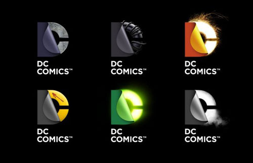
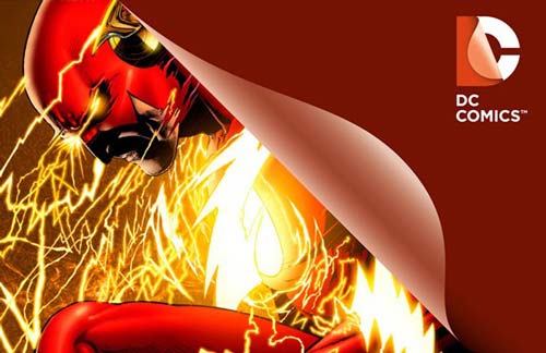
This is the latest DC logo redesigned on 2012. I wonder why the iconic round is no longer on the logo.
Now its your turn to share your thoughts about new DC comic logo. Like it? Hate it? Astonishing? Do you think new logo worth an applause? Start the debate!


